Hubert User Experience
The Problem
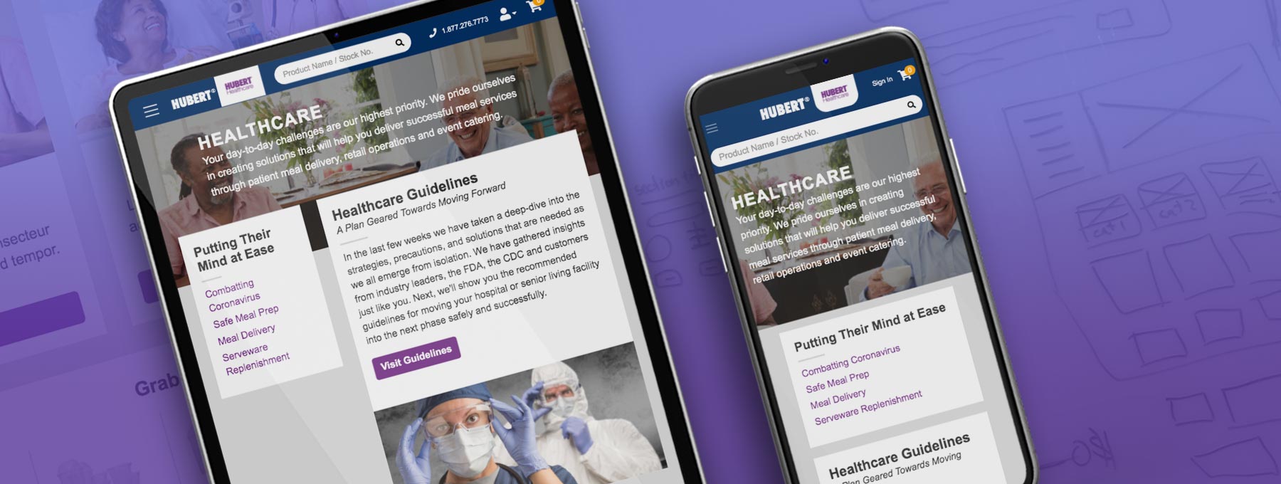
The e-commerce team had made considerable progress in updating the backend functionality of Hubert's website. However, the frontend of the site had not received the same level of attention. It was necessary to reconsider how site visitors would experience Hubert's healthcare products and services.
The Solution
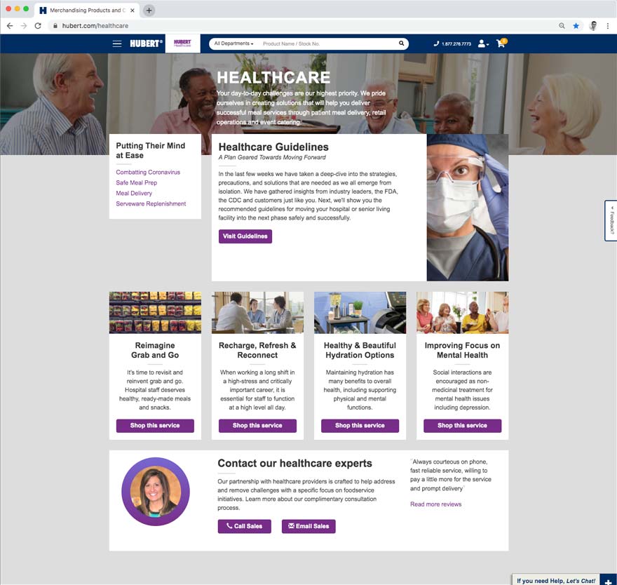
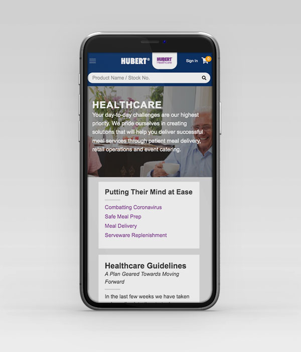
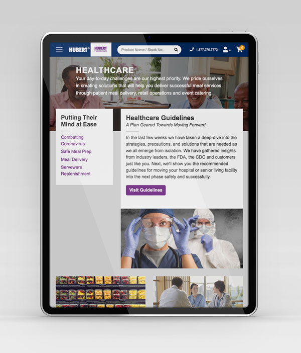
I collaborated with a Content Specialist and Developer to create a new Healthcare landing page. I conceptualized information presentation, selected and edited images, and authored HTML and CSS. Mobile viewing was prioritized by using card-based containers to maximize vertical space.
The New Design
This design incorporates insights from previous projects to optimize screen element arrangement. The CSS styles from earlier projects were consolidated into the master site style library.
Desktop
Mobile
Tablet
Investigating the Old Design
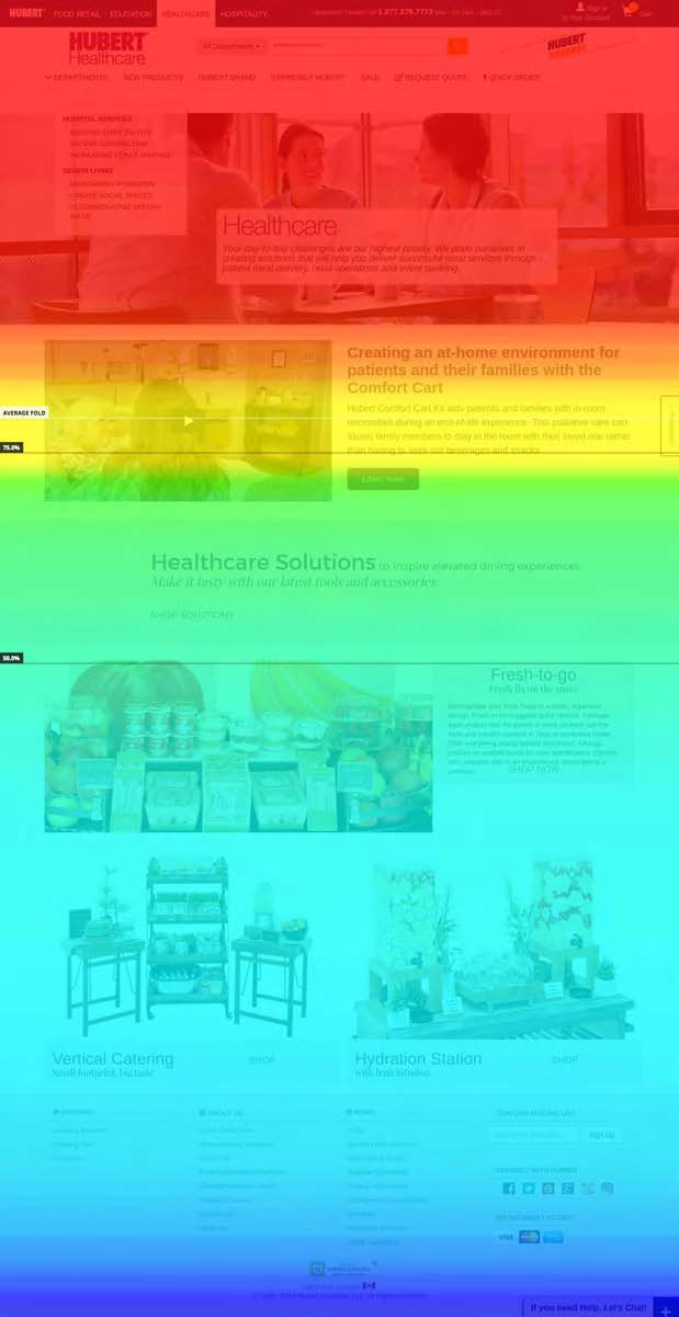
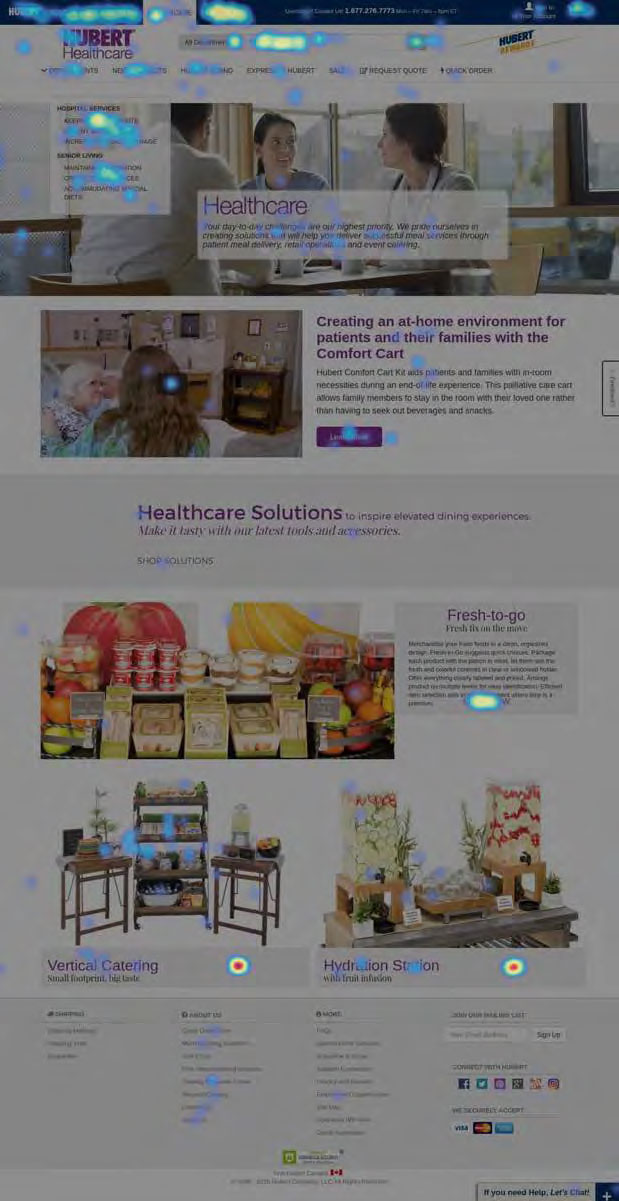
For the redesign, user interaction heatmaps of the old design were analyzed. They showed that the page wasn’t optimized as readers weren’t consuming the entire page. Click-through and conversion rates were low for products and services that should have appealed to our customers based on our research.
 Tory Kellen