
Content Solutions
Kellen Creative develops responsive content for display on desktop and mobile devices, interactive kiosks and exhibits.

Kellen Creative develops responsive content for display on desktop and mobile devices, interactive kiosks and exhibits.
This project included a responsive website based on the Foundation front-end framework. Also, a companion HTML newsletter was designed to accompany the site launch. Kellen Creative also provided training for content management to the end-users.
The intuitive content management system (CMS) enables users to make site edits directly in their web browser. The project can be viewed at oralhealtheconnect.com.

Landing page shown in Google Chrome browser
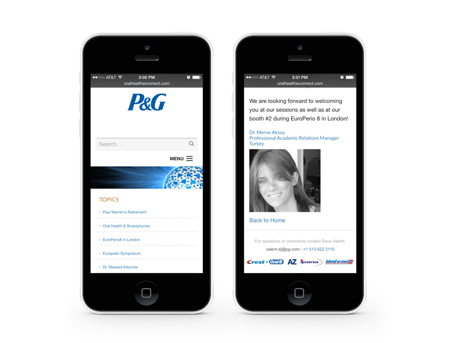
Pages shown in the iOS (9) Safari browser
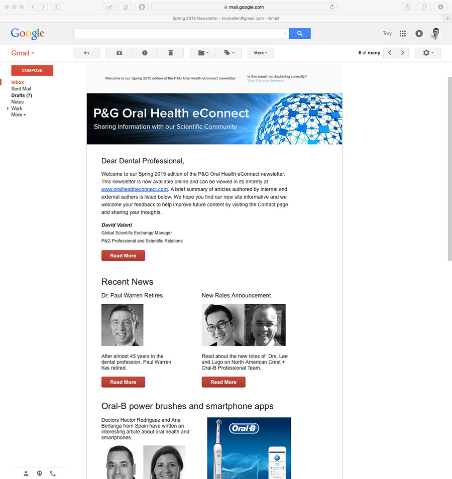
Email as seen in Google's Gmail client
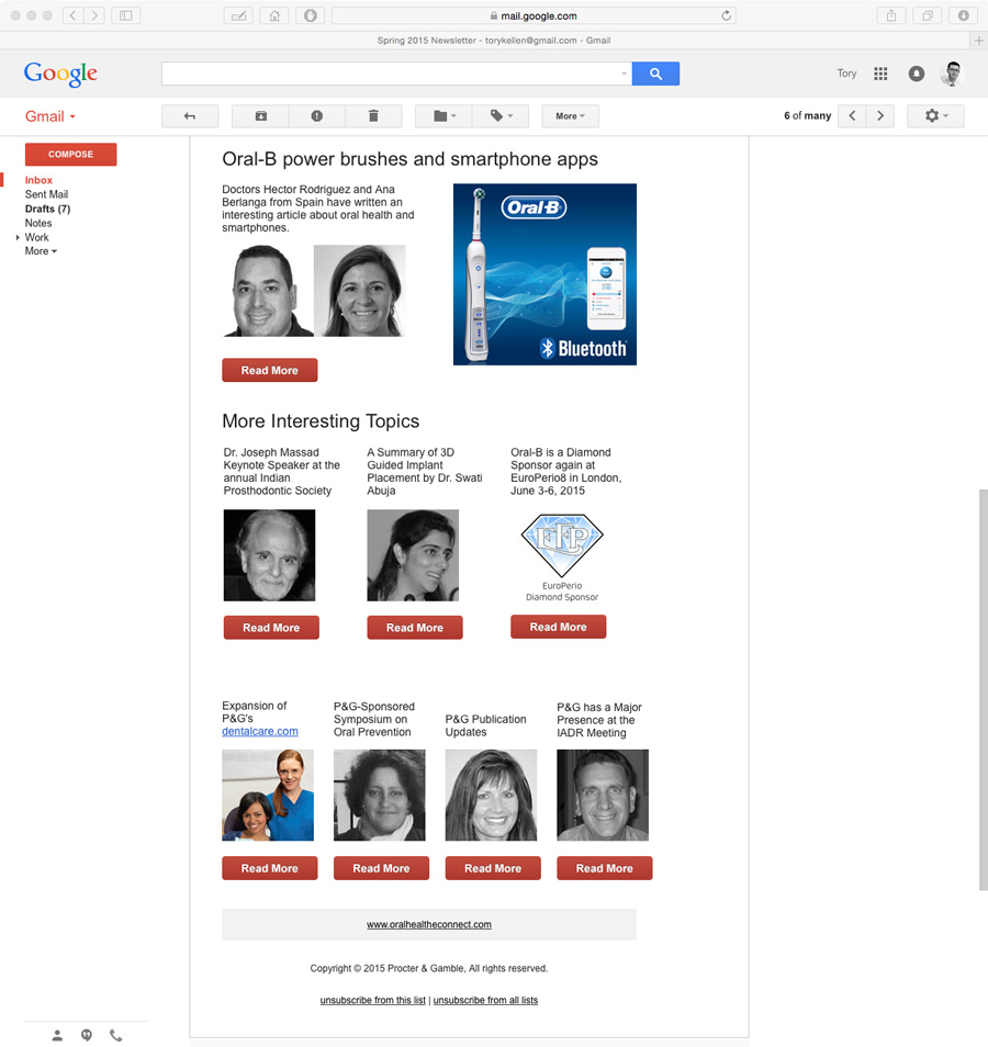
Email as seen in Google's Gmail client
An updated, responsive HTML Email design was needed which could function properly across the major Email clients in use by the audience. This responsive design would serve as the foundation of a targeted campaign with carefully curated content to deliver insightful industry news to readers.
The markup for this design was constructed with inline CSS styles to ensure content is displayed clearly in most major Email clients. Campaign analytics are provided in clear infographics with customizable data reports also easily configured.
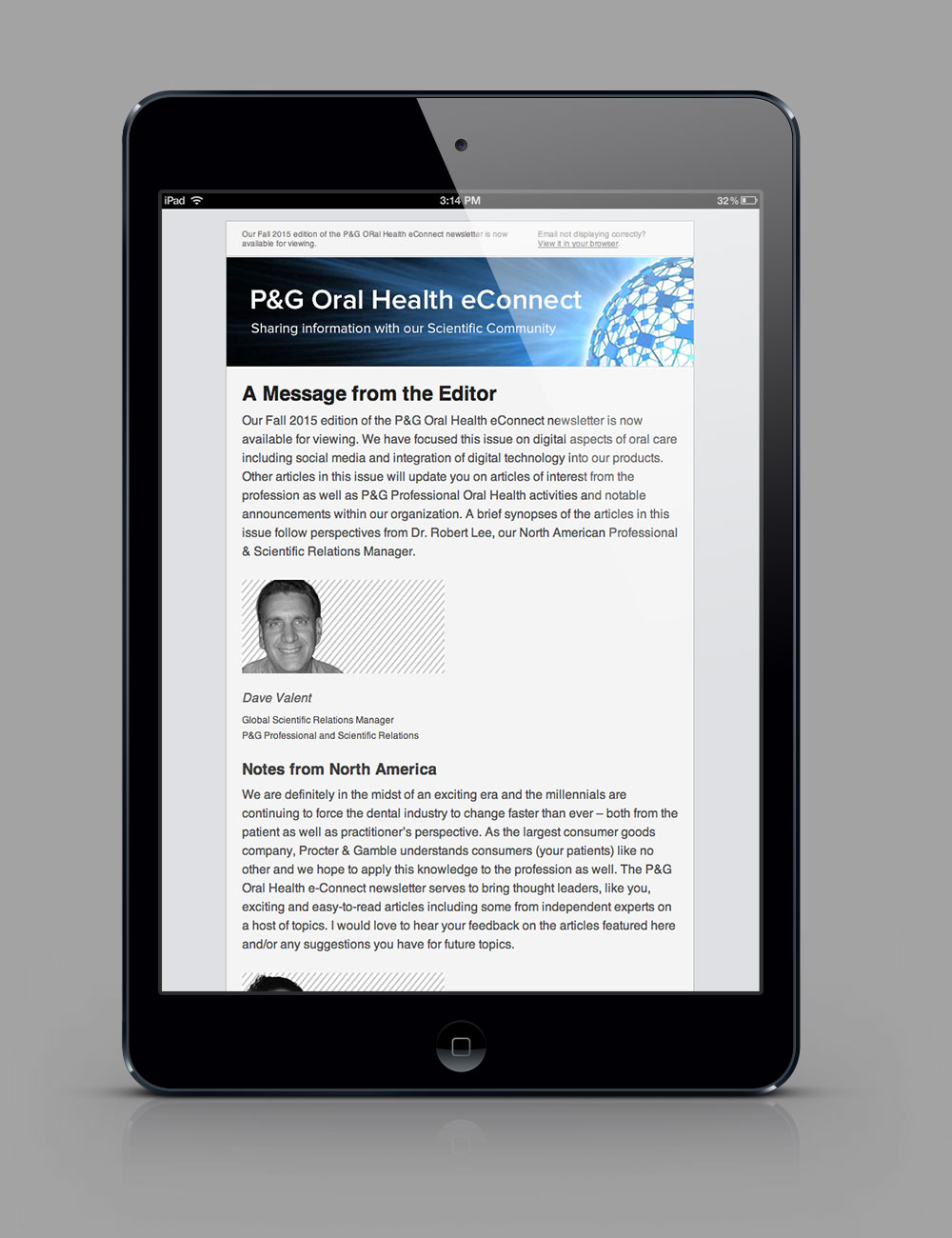
Email as viewed on iPad mini

Email as viewed on iPad mini

Email as viewed on iPhone
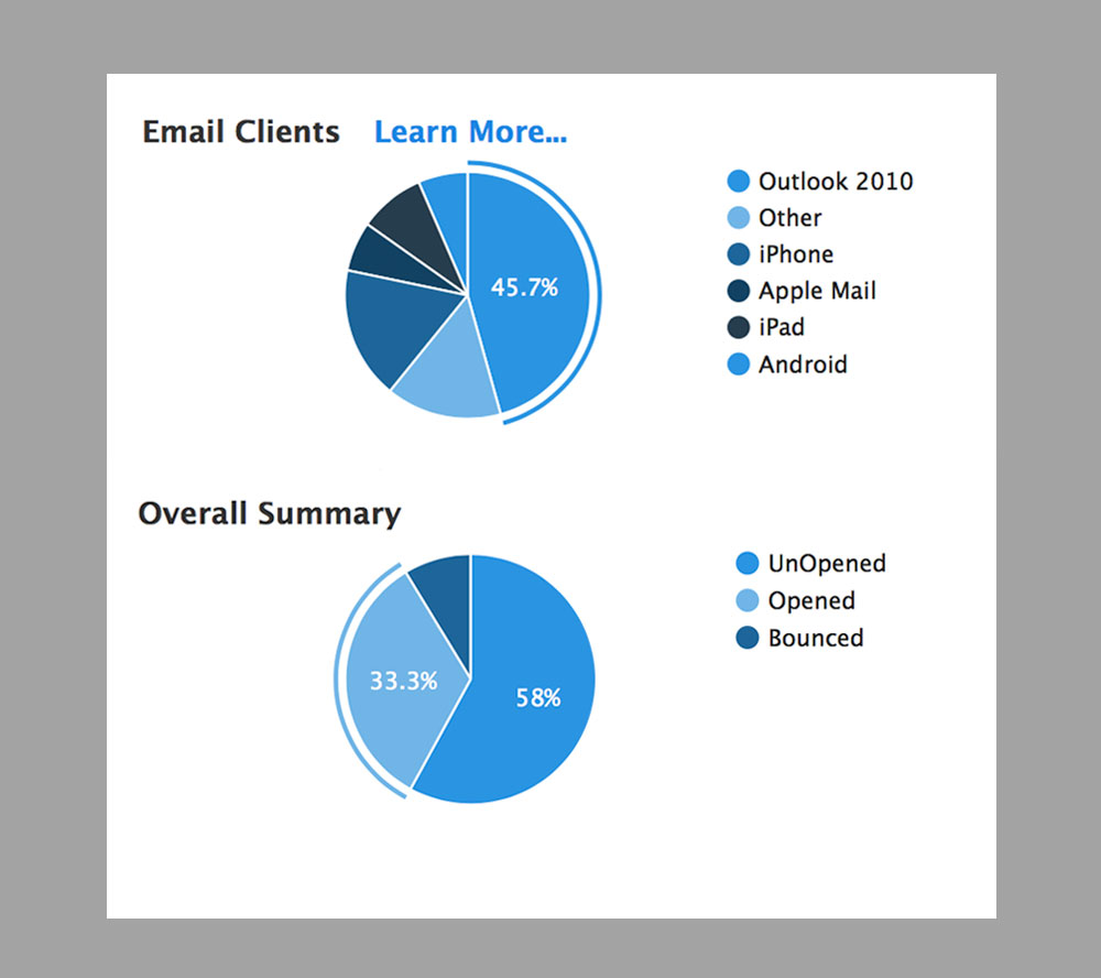
Sample Email campaign analytics
This interactive touch-screen monitor was designed as an informative companion to the various exhibits and installations housed at the Center For Holocaust & Humanity Education at Hebrew Union College in Cincinnati, Ohio. The intent was to arrange the content in a way that was easy to understand and navigate for the viewers.
The monitor is powered by an on-board Windows CPU and the content was delivered in HTML via the Google Chrome browser. Automated system functions were also programmed using AutoHotkey for Windows. This ensured ease of use on startup and shutdown procedures for non-technical operators as well as secure, unsupervised functionality.
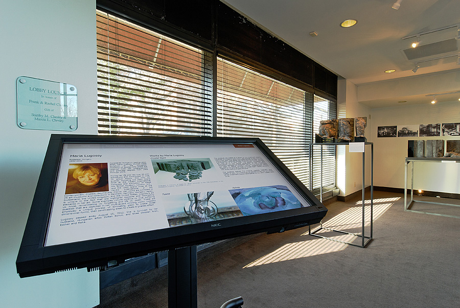
Interactive touchscreen monitor installed in display area
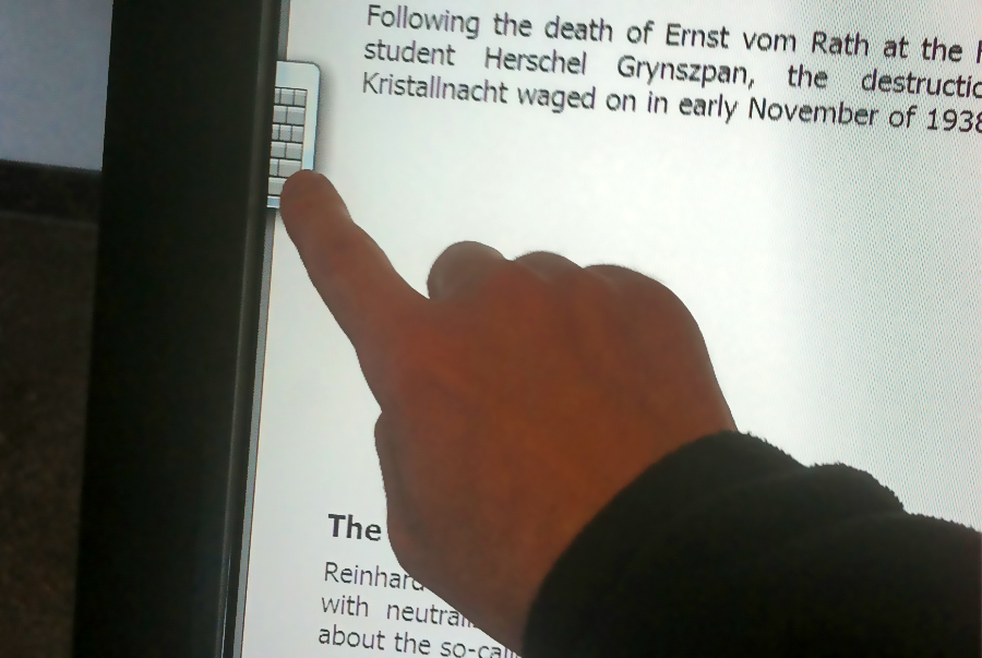
Input guestures were configured in OS to allow for ease of use
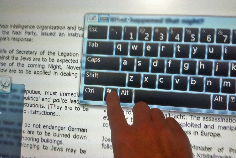
Certain guestures and inputs were disabled to ensure safe, consistant operation for general public
These designs were for a series of monitors in a digital signage system deployed at the newly renovated offices of the Cincinnati Regional Chamber. The intent was to provide layouts that facilitated various types of media that would stream to the monitors by way of digital signage media players (SpinetiX/Elementi). Art direction was taken from the client with the request of having different looks depending on monitor location.
These streams included dynamic text and image data feeds, video, and social media integration. My role also included hardware and software installation and programming for the players using signage authoring software (Elementi) and the Twitter API.
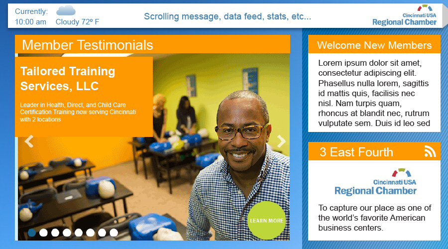
Design for the facade monitor #3
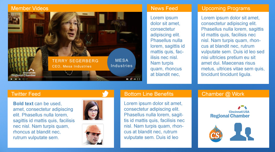
Design for the reception area monitor
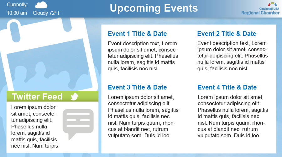
Design for the facade monitor #2
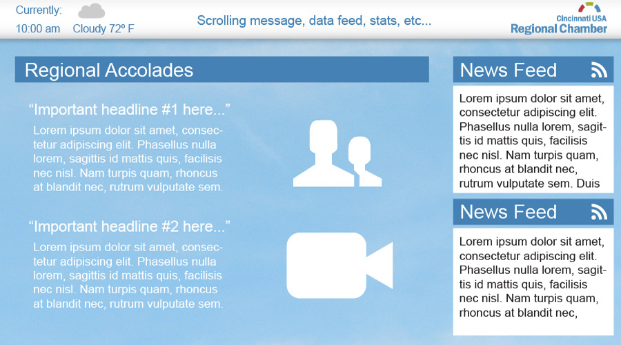
Design for the facade monitor #1